

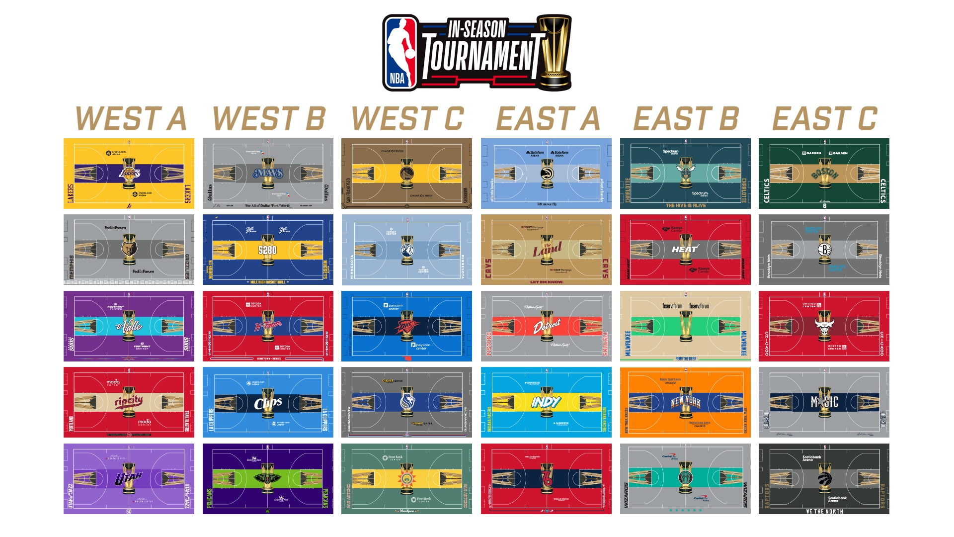
While they idea is cool, not all teams got a decent result…
Wizard’s got done dirty…that’s awful
I legit on the small thumb was like, “Oh cool, OKC did the Native American theme again,” then Zoom in and holy F that’s bad.
Ugh, the Grizzlies court looks disgusting. Grey is our 4th team colour… “bold and distinctive style” my ass.
New Orleans got a bad one. So did Indiana.
I am irrationally annoyed that some teams have a logo in the middle and some have a city or team nickname. Probably because the Celtics are one of the teams with text.
Some of them are pretty great, some of them are pretty bad (the Nets).
Personally I like Bulls and GSW, I really don’t like (my) Cavs and all the ones with too much contrast (Lakers), but then I see Washington’s non sense palette and…
Yeah they need to consider if the designs translate well on a screen.
Really like the Spurs one.
I was just thinking I hate it… Maybe I’m just old, but those aren’t Spurs colors for any color scheme they’ve ever had, and I’ve never seen that logo at mid court.