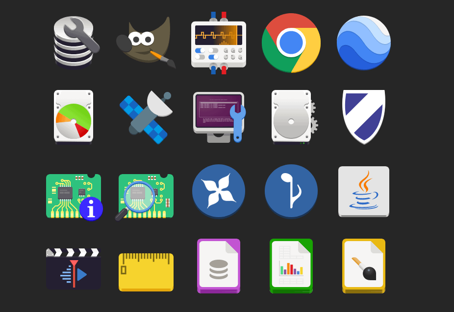
I don’t know about all of you, I don’t like these new flat icons that everyone is using. What ever happened to the old icons, like on iPhone and Samsung they used to have them years ago. Those were good times. Now it is always these stupid boring cartoonish designed icons. Side note: Somebody please update this icon pack. I am trying to use it on xfce on arch but some of the icons aren’t working properly because it hasn’t been updated in a while. I’ll donate to you right away if you do it. Link to the repo: https://github.com/madmaxms/iconpack-obsidian


I think I’m in the same place. I really like the idea of icons having depth. Modern icons are very versatile, but lack personality. Having some depth gives them some weight, but never really liked the emphasis on curves and gradients. I think a mix of original Material design and just a hint more depth would be the perfect sweet spot.
I’m curious how you feel about the GNOME application icons, they sound like they might be up your alley
Right now I generally have a preference for either weird stylized themed stuff I make myself, or very flat stuff like what android currently does for app icons, but I can certainly see the appeal of other stuff :)
I really like the application icons used in Gnome but I really like the consistent line weights and geometry of material symbolic icons so I’m still using a material icon pack on gnome
Edit: Here’s a picture I grabbed of icons done in the adwaita style Gnome uses in case you don’t use linux and aren’t familiar with them. Its not a full sampling, but you get the idea :)
Take these icons, add one more layer of simple gradient shading: perfection
For example, GIMP’s icon looks especially bad here to me. If it had just a hint of black shading, it would look massively better (imho).
Interesting, thanks for sharing your perspective with me! ☺️
Any time! I’m a graphic nerd with none of the book learning, but I do work at a screen printing shop, so I have some intuitive understanding of logo/icon design, but don’t have the theory to go with it.
In other words, I have wildly subjective opinions that I’ll randomly dig my heels in on. (Sometimes when I have no idea what I’m talking about ha!)