I don’t know about all of you, I don’t like these new flat icons that everyone is using. What ever happened to the old icons, like on iPhone and Samsung they used to have them years ago. Those were good times. Now it is always these stupid boring cartoonish designed icons. Side note: Somebody please update this icon pack. I am trying to use it on xfce on arch but some of the icons aren’t working properly because it hasn’t been updated in a while. I’ll donate to you right away if you do it. Link to the repo: https://github.com/madmaxms/iconpack-obsidian


a skeuomorph (from greek, “tool/container-shape”) is something that retains the characteristics of another thing that it is based on, even though those characteristics are no longer useful. think lamps shaped like candles, or the floppy disk save icon, or media player programs with volume knobs.
skeuomorphic UX is a good way to get users comfortable with a system by using designs they are already familiar with, and the original iphone used this to great effect.
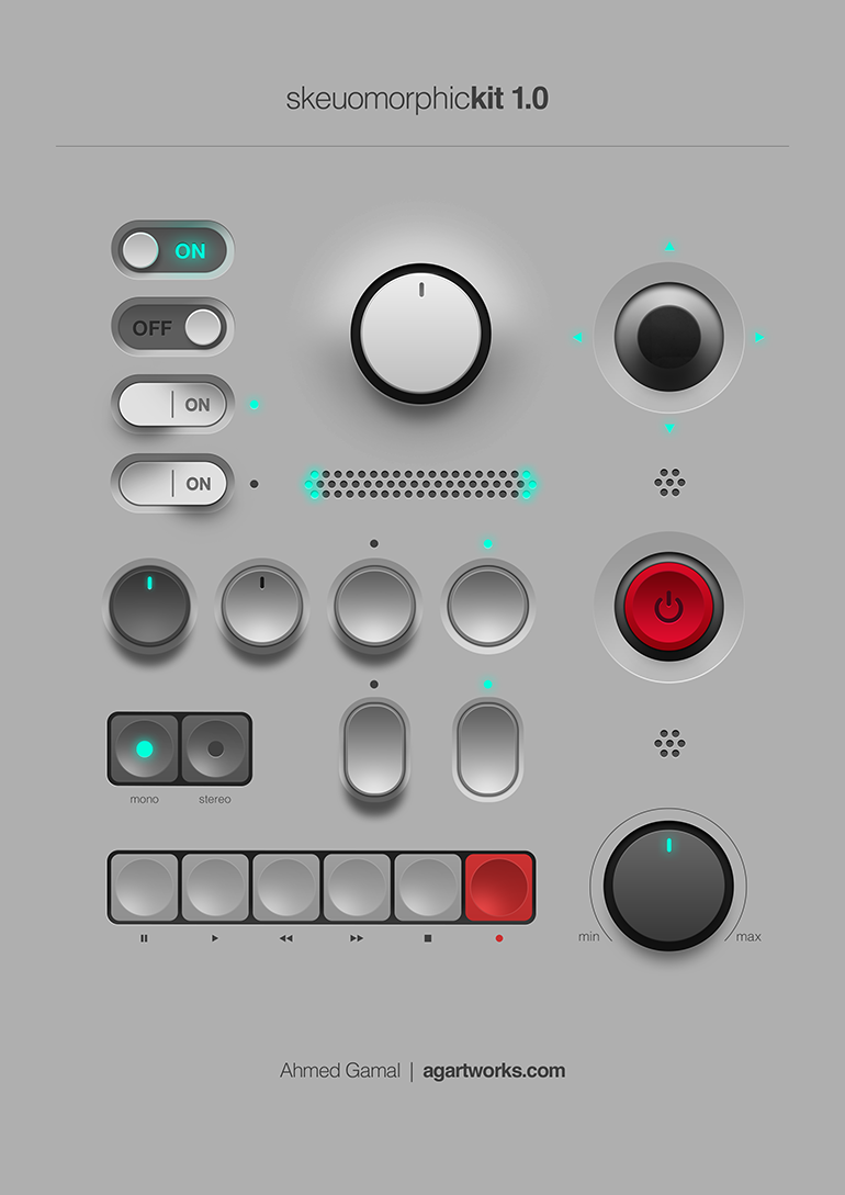
This is a good example of skeuomorphic UI:
all to say, I’m not entirely sure these icons are skeuomorphs. they’re just glossy.
Yeh the files being little pieces of paper, and the folders being old office folios are skeumorphic. Skeumorphic was (or is?) sometimes used more generically for ui elements made to look physical so perhaps the pseudo 3D shading, dropshadows, bevels and highlights qualify much of OPs examples, though they aren’t representing any specific type of physical object necessarily. Just objects to be grabbed and used (clicked).
I’m sure trends will bring us back to a similar style at some point like they often do.