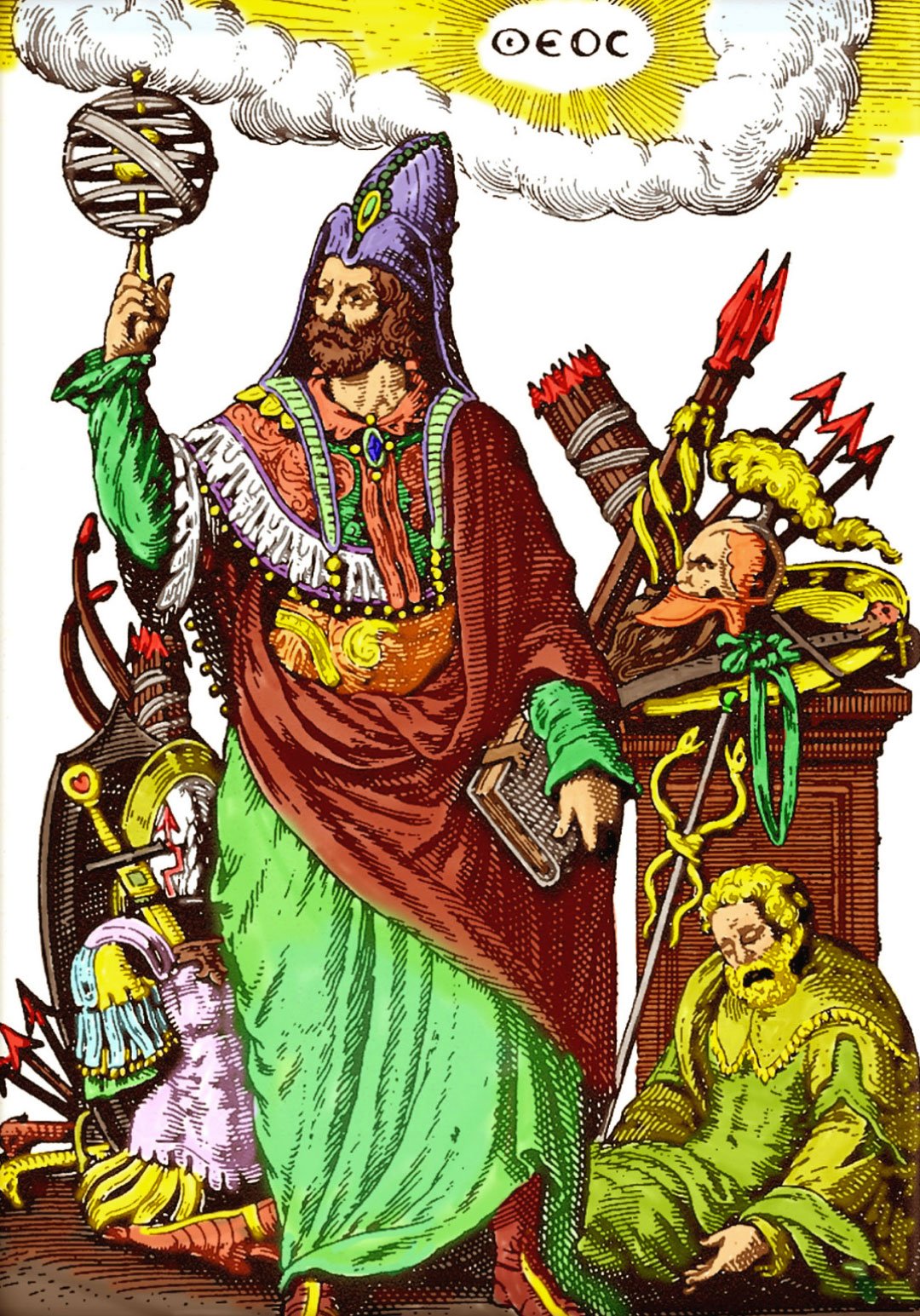
I don’t know about all of you, I don’t like these new flat icons that everyone is using. What ever happened to the old icons, like on iPhone and Samsung they used to have them years ago. Those were good times. Now it is always these stupid boring cartoonish designed icons. Side note: Somebody please update this icon pack. I am trying to use it on xfce on arch but some of the icons aren’t working properly because it hasn’t been updated in a while. I’ll donate to you right away if you do it. Link to the repo: https://github.com/madmaxms/iconpack-obsidian
I use this icon pack. A very good GTK/Qt/Kvantum/whatever is Simplewaita. It goes together well with the icon pack.
I miss the time when not all icons were a rectangle or a circle.
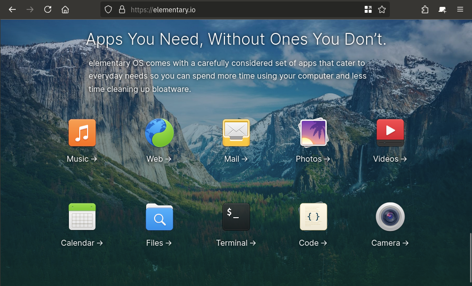
i don’t, not at all, but still think elementaryOS looks beautiful! Like holy hell, even on their websites they manage to make their design look good!

Colorful icons were amazing. That’s literally why the iMac sold so well. Colorful. Prove me wrong.
It’s nice and easy on the eyes. I conjecture that glossy and matte (as seen here) styles of skeuomorphism gave way to more abstract design since:
- Skeuomorphism is hard to get just right without being excessive and tacky
- Saturated, simple blocks of color pop out more, particularly on the increasingly prevalent mobile UI
- And thus also have better shelf appeal
If it were up to me, the red line would be when buttons and interactive elements are indistinguishable from text. The stock Android settings is probably among the worst offenders in this regard.
What I really miss is light mode that isn’t hated for blinding users and dark mode that doesn’t plunge the user into the void. Those “toolbars” look lovely, perfect for any lighting condition or time of day. I’ve yet to understand why, at present, designers insist on pure white everywhere when it comes to light mode. Maybe everyone is using the night light filter so it doesn’t matter? At least pure black dark mode makes sense for power efficiency on OLEDs.
Skeuomorphism is hard to get just right without being excessive and tacky
that was always my impression of os x back in the day. it felt tacky as hell. i’m a linux guy, but windows’s aero was so much more beautiful
Personally I don’t, I kinda hate old skeuomorphism 😅
Neo skeuomorphism has some neat novelty though.
Edit: this is just my personal aesthetic preference, I don’t begrudge anyone their love of skeuomorphism, or nostalgia for it.
I think I’m in the same place. I really like the idea of icons having depth. Modern icons are very versatile, but lack personality. Having some depth gives them some weight, but never really liked the emphasis on curves and gradients. I think a mix of original Material design and just a hint more depth would be the perfect sweet spot.
I’m curious how you feel about the GNOME application icons, they sound like they might be up your alley
Right now I generally have a preference for either weird stylized themed stuff I make myself, or very flat stuff like what android currently does for app icons, but I can certainly see the appeal of other stuff :)
I really like the application icons used in Gnome but I really like the consistent line weights and geometry of material symbolic icons so I’m still using a material icon pack on gnome
Edit: Here’s a picture I grabbed of icons done in the adwaita style Gnome uses in case you don’t use linux and aren’t familiar with them. Its not a full sampling, but you get the idea :)
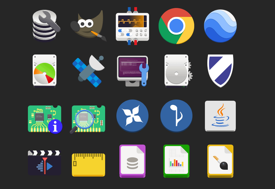
Take these icons, add one more layer of simple gradient shading: perfection
For example, GIMP’s icon looks especially bad here to me. If it had just a hint of black shading, it would look massively better (imho).
Interesting, thanks for sharing your perspective with me! ☺️
Any time! I’m a graphic nerd with none of the book learning, but I do work at a screen printing shop, so I have some intuitive understanding of logo/icon design, but don’t have the theory to go with it.
In other words, I have wildly subjective opinions that I’ll randomly dig my heels in on. (Sometimes when I have no idea what I’m talking about ha!)
God, no!
Though these do look pretty, they don’t look like the buttons in Windows 95/XP and maybe that’s a good thing.
I liked the soft gradient XP icons, though maybe that’s just the nostalgia talking
I am a papirus man

For those who haven’t seen snl’s papyrus skit:
https://www.youtube.com/watch?v=jVhlJNJopOQ
Or papyrus 2:
https://www.youtube.com/watch?v=Q8PdffUfoF0
A couple of the best sketches SNL has ever done
I upvoted your comment just because it had links to the reference you made.
Also, the sketches were funny; thanks for sharing them.
Thanks, glad you enjoyed them!
This is the first time Ive ever seen those vowels together
If I understood it correctly, in this context it means that the icons normally retain the original logo and color scheme, while incorporating them into a single style.
a skeuomorph (from greek, “tool/container-shape”) is something that retains the characteristics of another thing that it is based on, even though those characteristics are no longer useful. think lamps shaped like candles, or the floppy disk save icon, or media player programs with volume knobs.
skeuomorphic UX is a good way to get users comfortable with a system by using designs they are already familiar with, and the original iphone used this to great effect.
This is a good example of skeuomorphic UI:
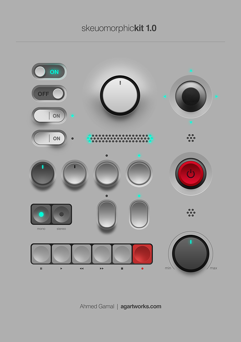
all to say, I’m not entirely sure these icons are skeuomorphs. they’re just glossy.
Yeh the files being little pieces of paper, and the folders being old office folios are skeumorphic. Skeumorphic was (or is?) sometimes used more generically for ui elements made to look physical so perhaps the pseudo 3D shading, dropshadows, bevels and highlights qualify much of OPs examples, though they aren’t representing any specific type of physical object necessarily. Just objects to be grabbed and used (clicked).
I’m sure trends will bring us back to a similar style at some point like they often do.
skeumorphism is fucking ugly and it’s the main thing that made me dislike the appearance of os x back in the day. it honestly blew my mind people found apple to be the vanguard of graphical design
